Creation of the logo of a real estate agency
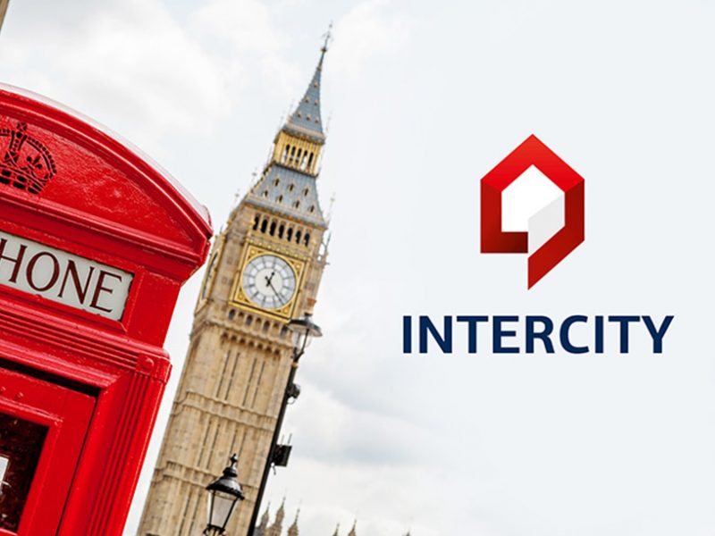
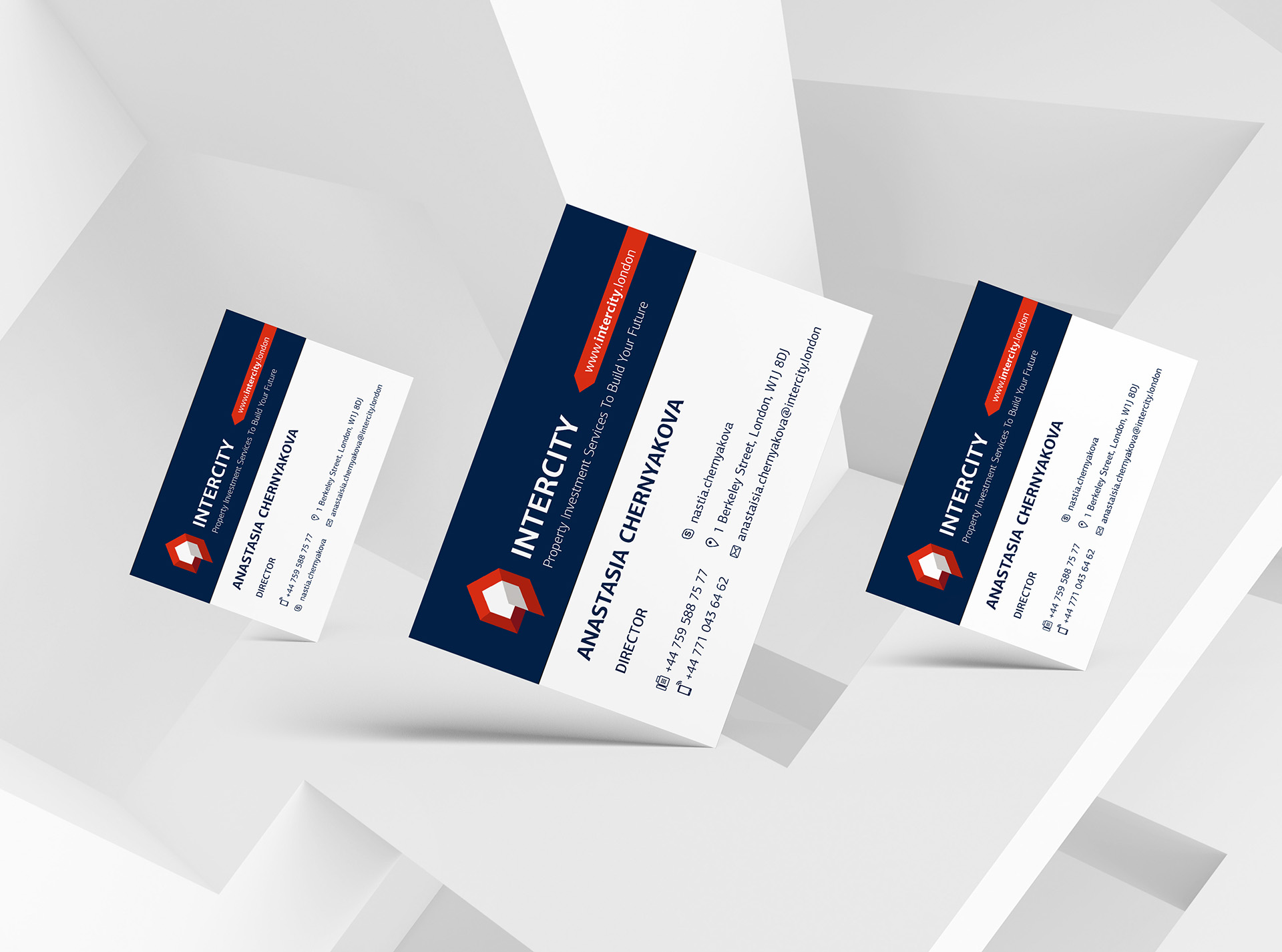
I created the logo “Intercity” with clean geometrical forms with a reference to a stylish and laconic architecture of a house. Such choice emphasizes the company’s profile, its integrity and success.
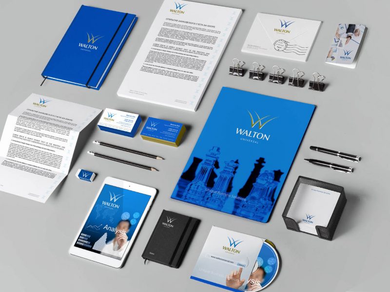
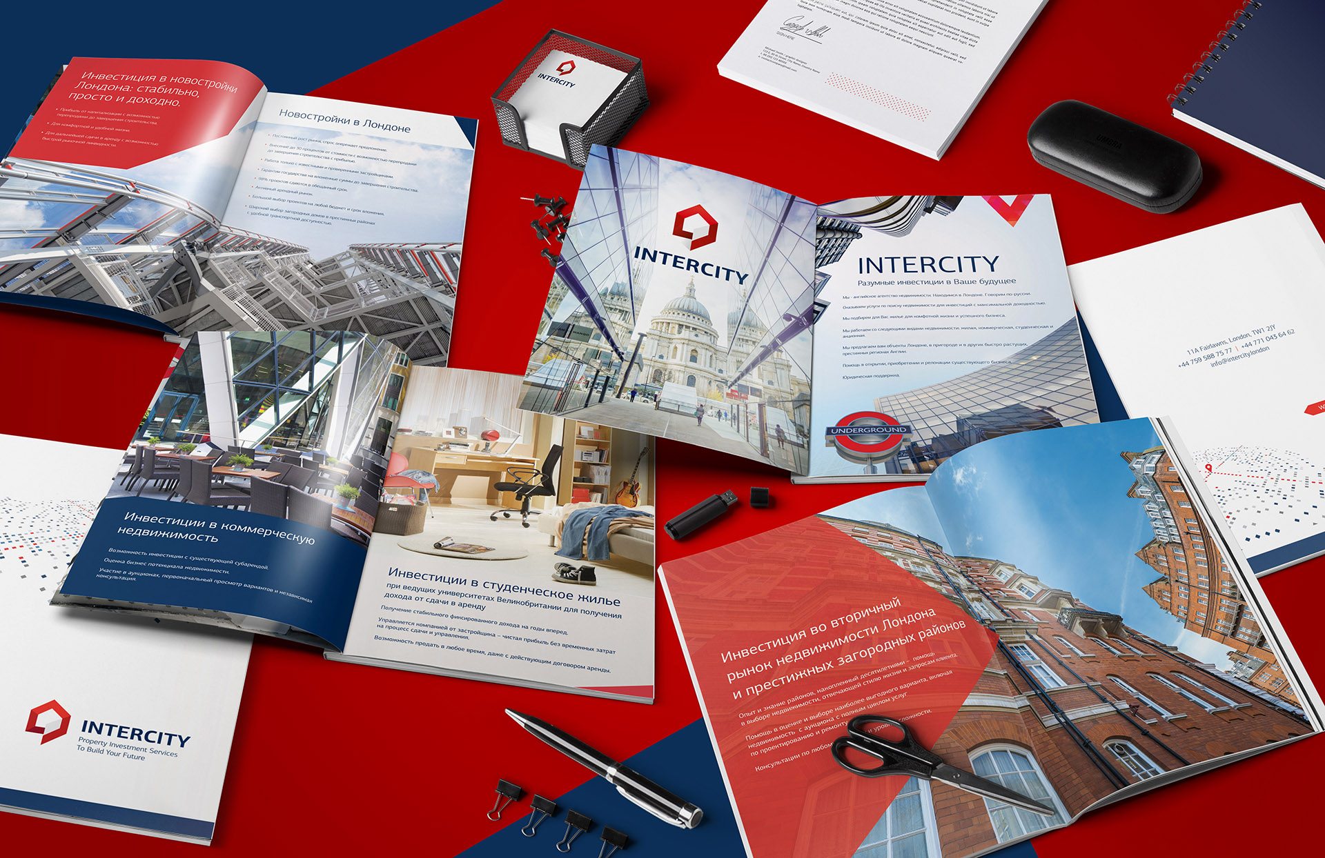
I also created the corporate identity based on the principles of innovation and clarity. I chose to use sans-serif typography to add expression to the clean logo’s composition.
Bright and attractive red, white and blue colors made the color palette of the real estate agency.
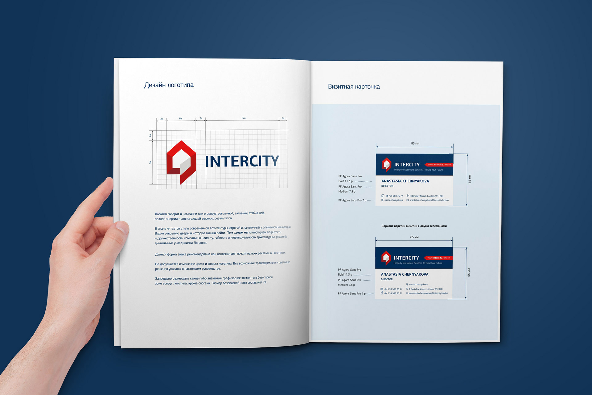
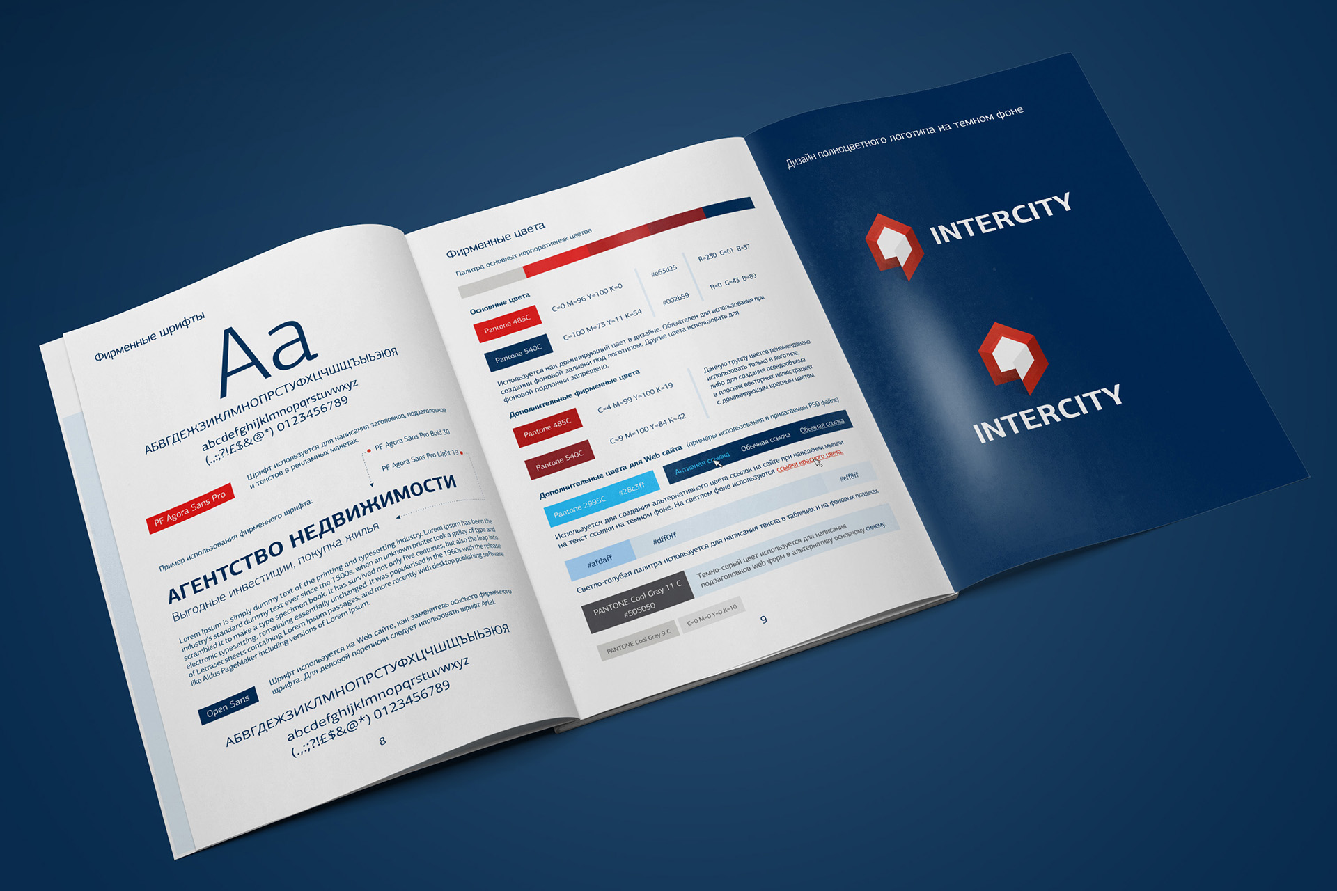
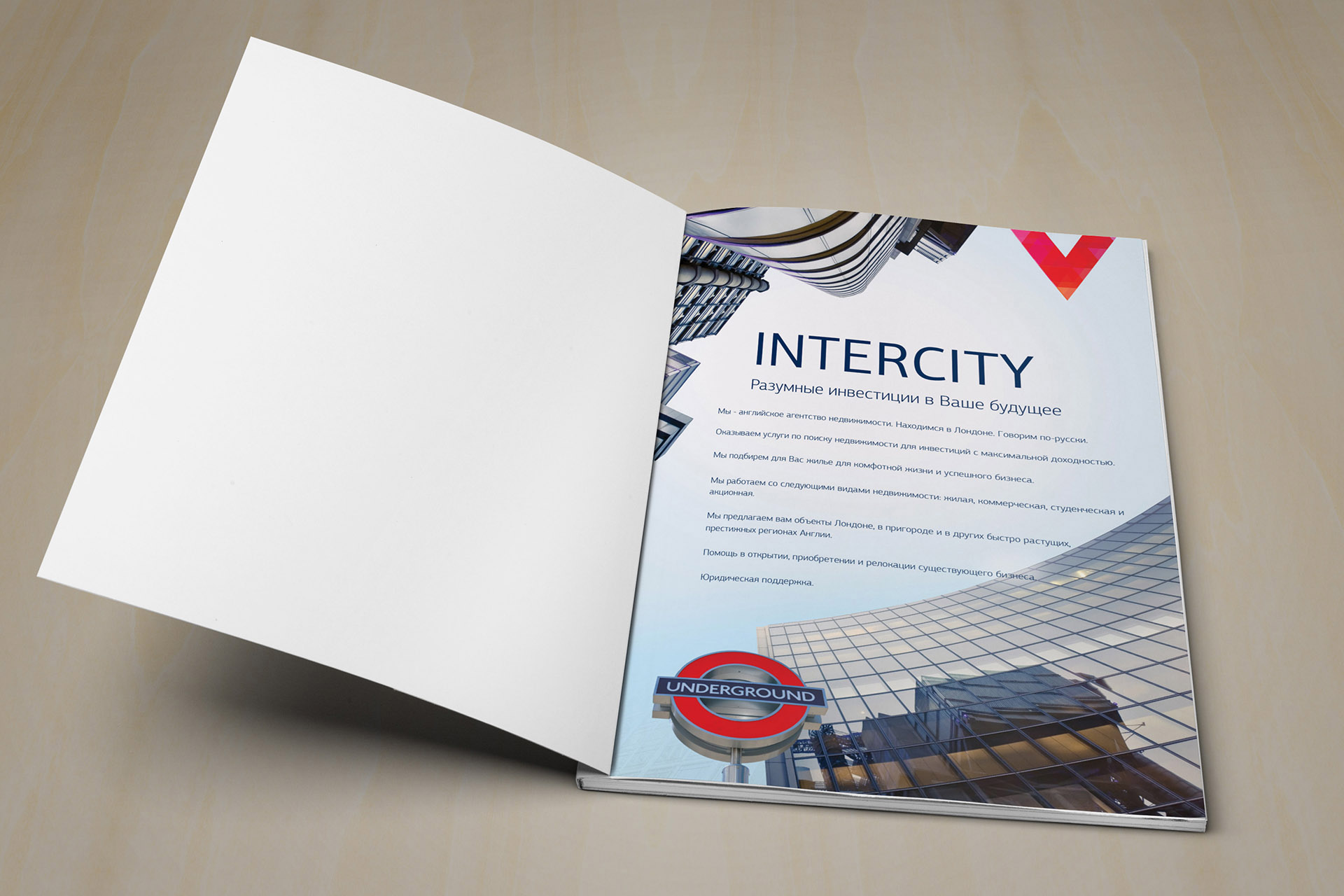
Brand Book of the Real Estate Agency «Intercity»
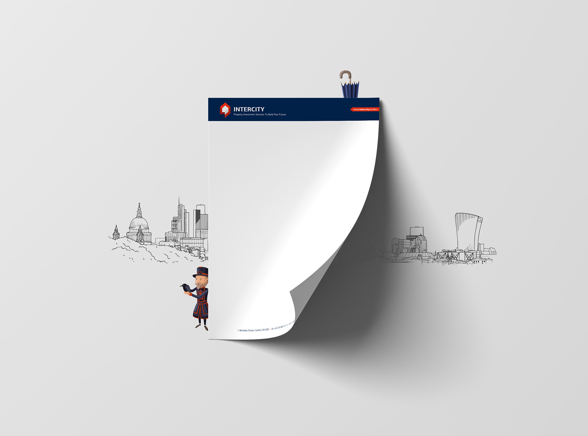
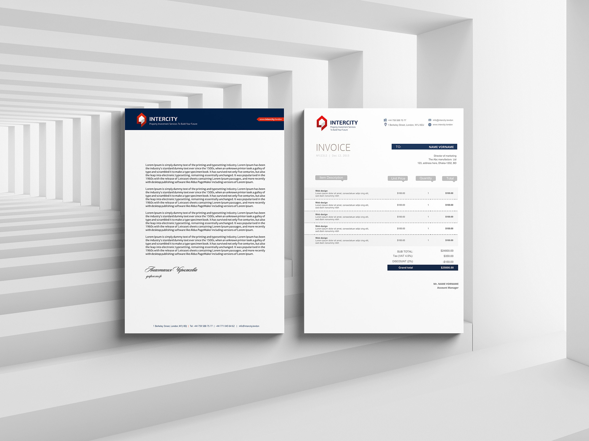
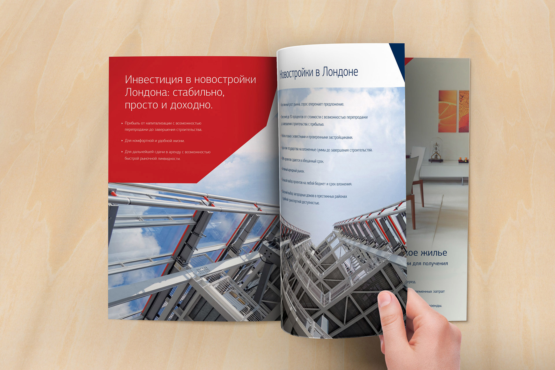
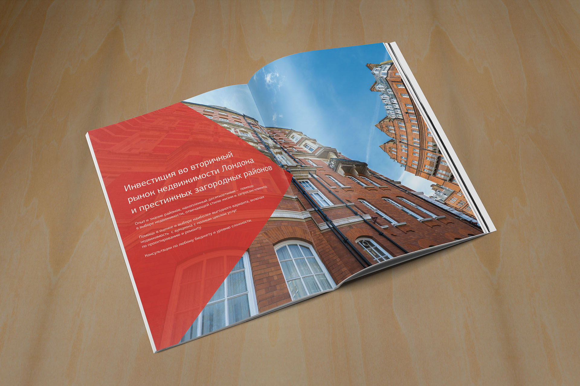
Structure: logo design; typography design; color palette; company folders; presentation PowerPoint; design of the landing page of the website; billing forms; business card design; stationery design; catalogue design


Portfolio category
Show all


