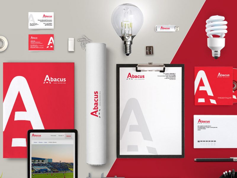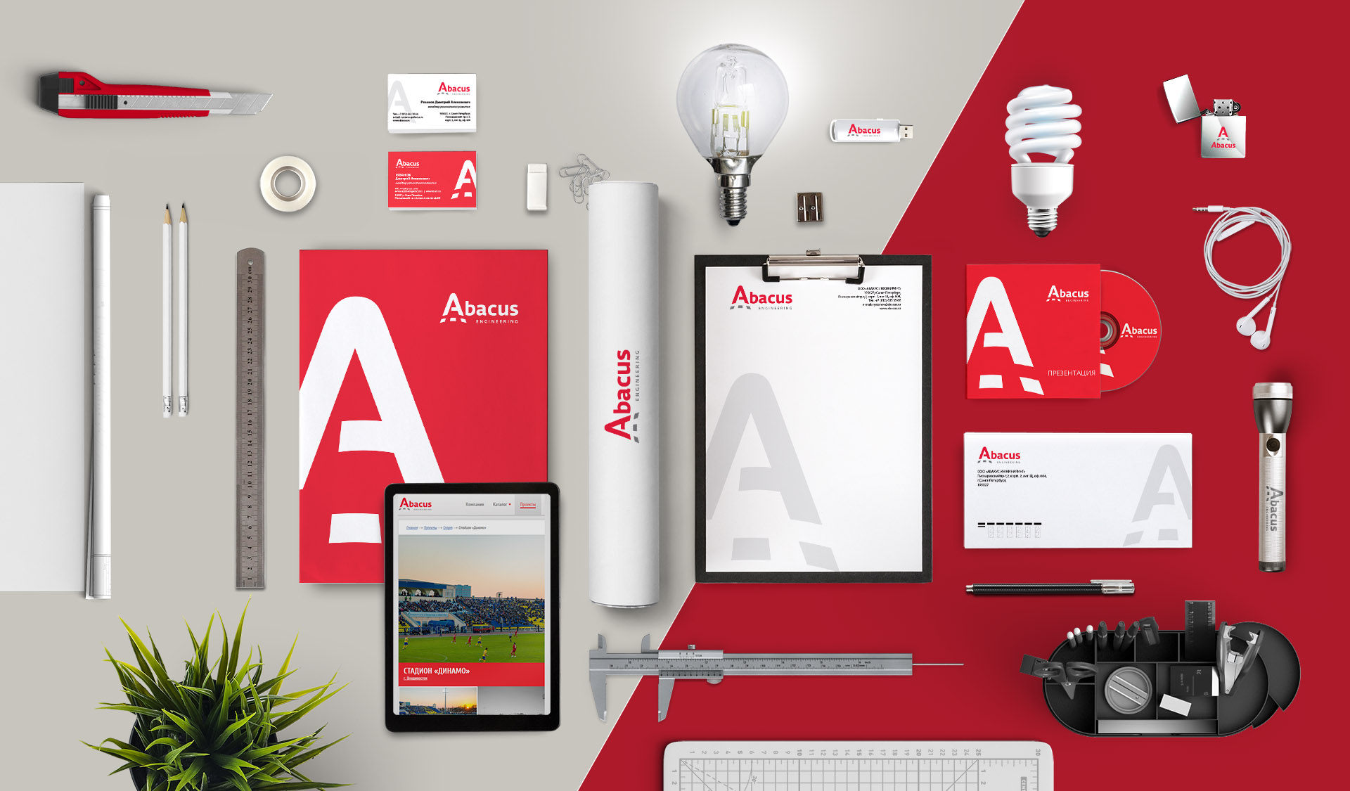
Development of the brand book of the engineering company «Abacus»
The lightning engineering company «Abacus» designs and manufactures lightning solutions for residential complexes, highways, airports, stadiums and parks. The company employs innovative technologies to create new projects and update existing ones.
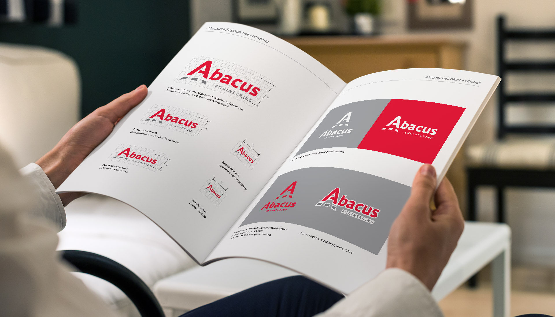
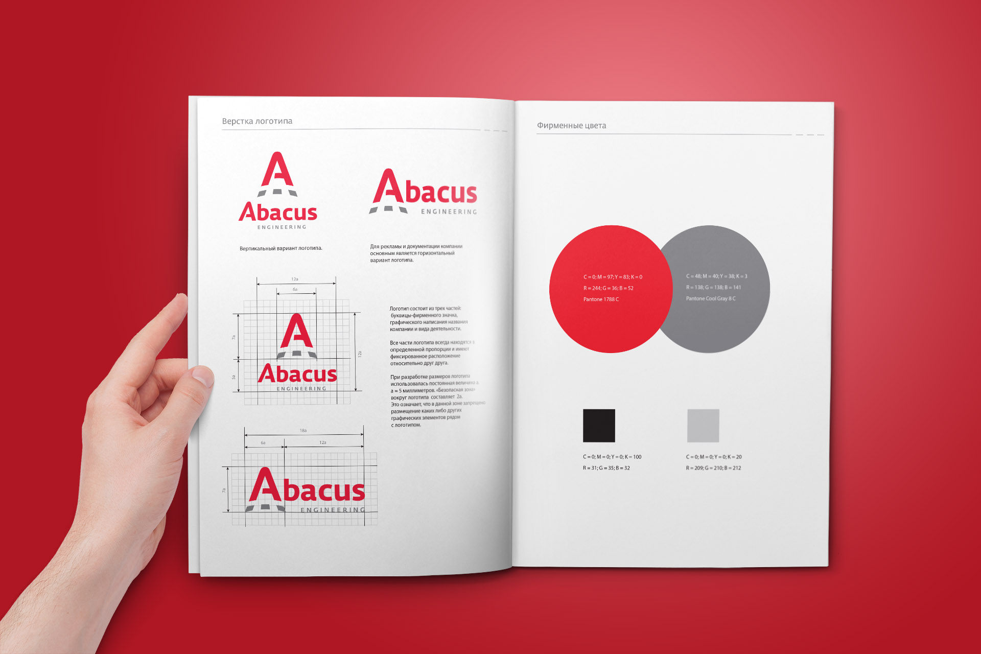
Creation of the logo and the brand book of the engineering company
The logo represents the stylish letter «А». The corporate color palette includes red and grey. Red is a symbol of beauty. We need light to appreciate the beauty of the world. Grey is a reserved technical color.
The logo is laconic. The bright red color makes the logo expressive and recognizable.
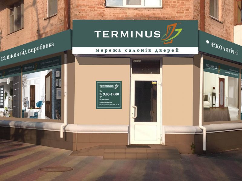
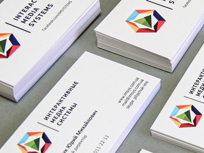
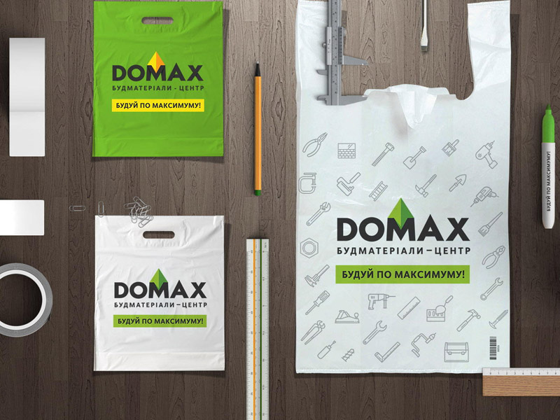
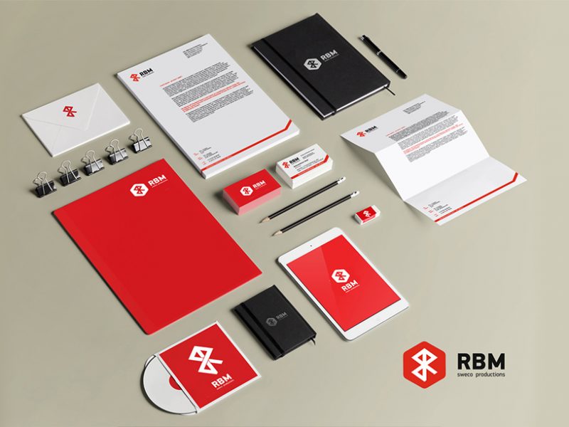
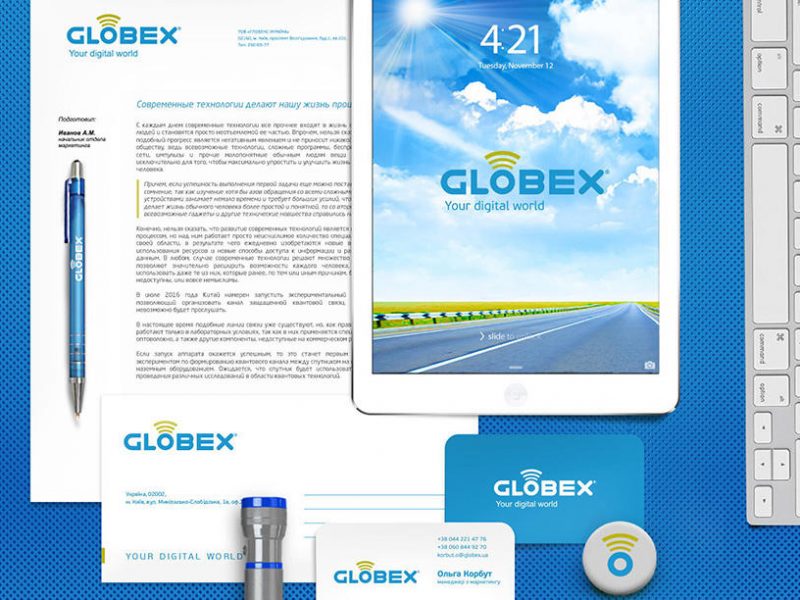
I also designed the brand book, corporate identity and promotional items.
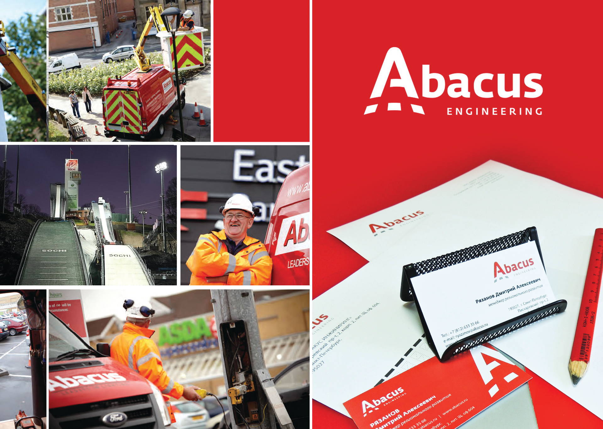
My project took the second prize in the nomination «Сorporate Identity» at the “ELECTRO REKLAMA 2015” Exhibition!
The committee members recognized the corporate identity of SYSLIGHT one of the best among lighting and electric companies.
It is a big victory for me. I am even happier that that the first price went to the corporate identity of another company I designed as well.
You need to have the sun 
[supsystic-social-sharing id=’2′]
Portfolio category
Show all
[supercarousel id=7618]


