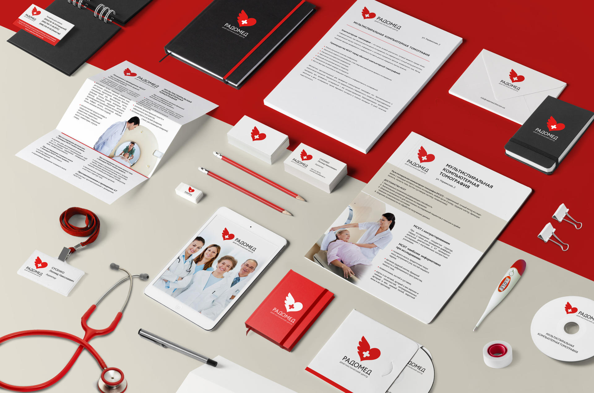
Corporate identity of the diagnostic center
Radomed is a medical diagnostics center with a good reputation, advanced equipment and highly skilled doctors.
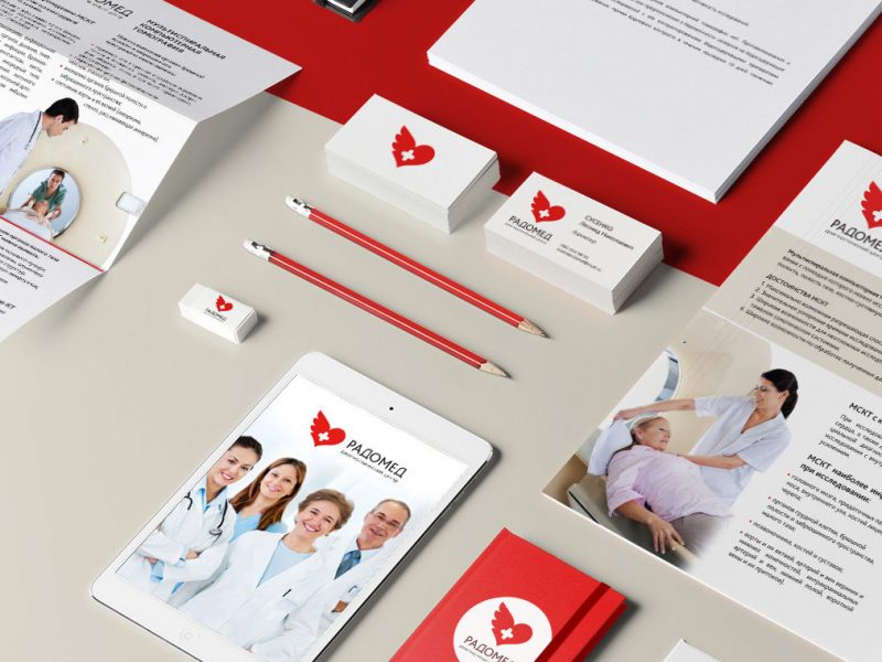
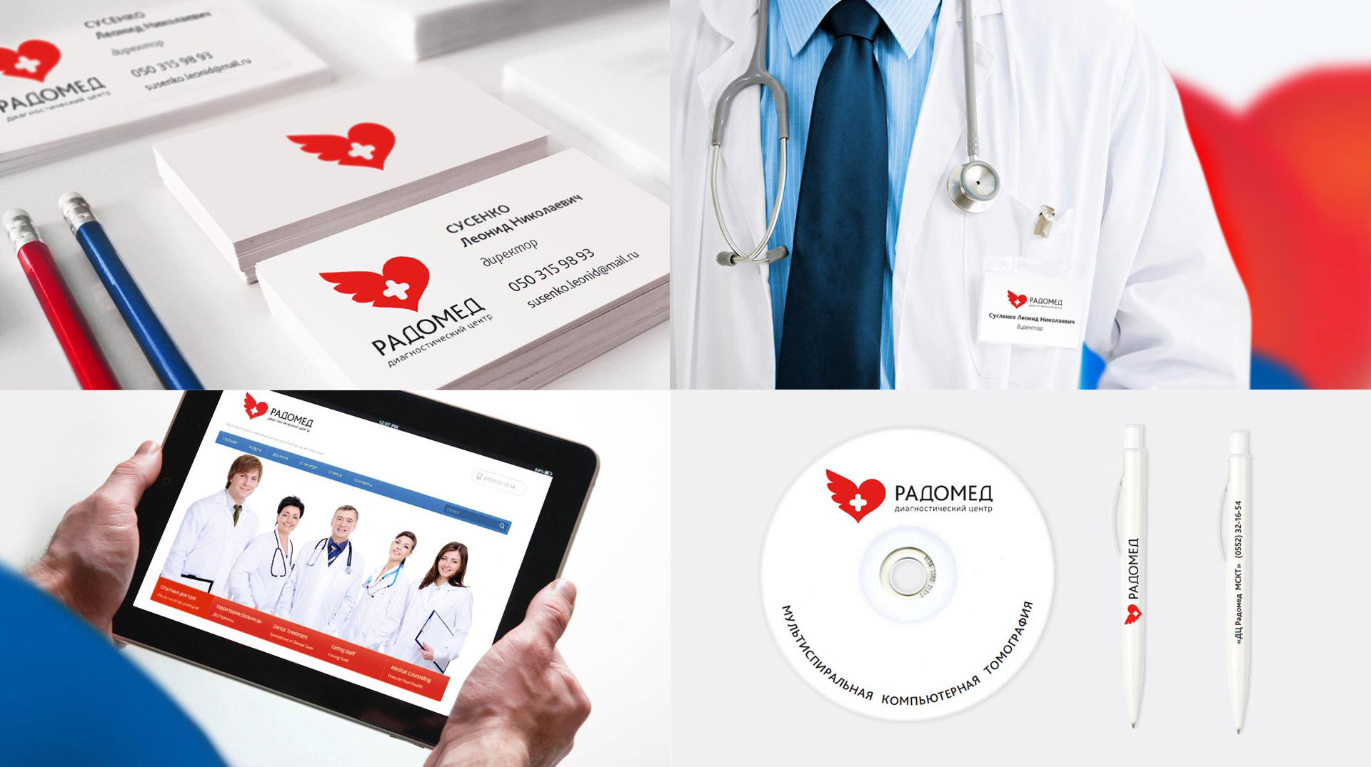
I created the name for the center. I also designed its logo, corporate identity and website.
.
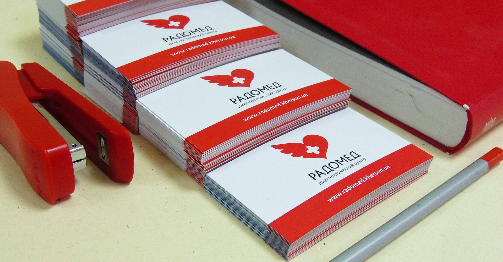
 Brand book and website design of the diagnostic center
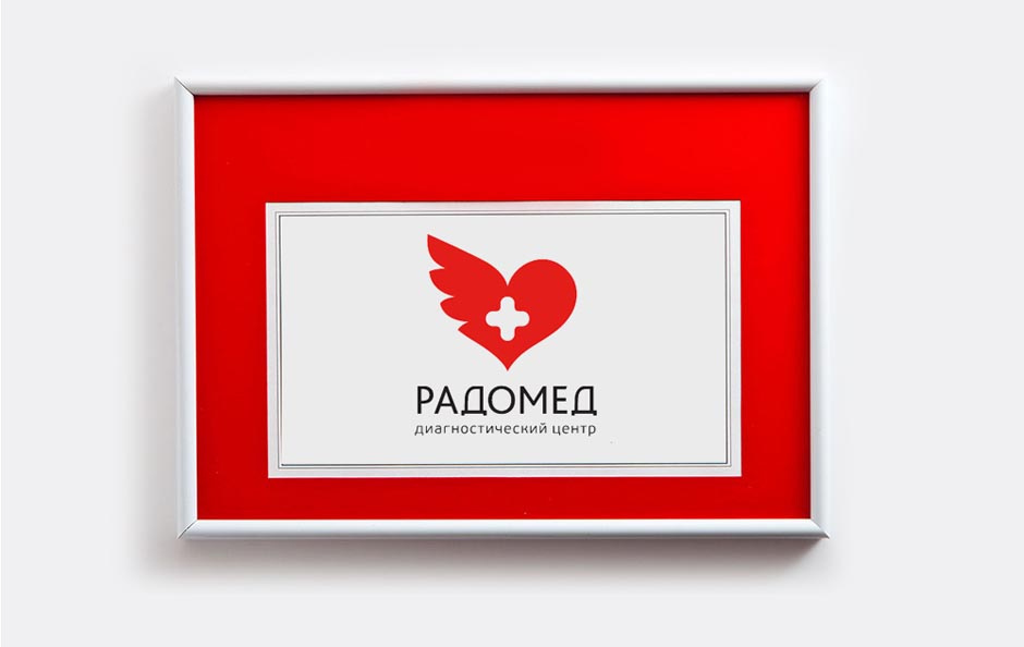
I combined the traditional colors – red and blue. The graphical logo combines a cross, a heart and a wing. A red cross is a traditional medical symbol. A heart is a symbol of love and care while a wing is a symbol of protection.
The logo is easy to understand and remember. It taps into good emotions and inspires trust.

Joy of life is the keystone of health .
Portfolio category
Show all


